Showing posts with label Color. Show all posts

3.28.2011

Inspiring Color: Chartreuse & Gray

 
New favorite color combo: Chartreuse and Gray. 
Also diggin' the thick stripes and Chartreuse tufted settee.

photo via here

10.29.2010

INSPIRING COLOR: ORANGE

At Modern Palm we are
Falling for Fall Colors
especially the
Inspiring Color:  
Orange
 journals, bakers twine, mugs, and serving pieces
Orange is  powerful, warm, energetic, and spicy. It is one of the healing colors, and is said to stimulate enthusiasm and creativity. Orange means vitality with endurance, and curiosity. People who like orange are usually thoughtful and sincere. Orange has become a great base color for interior decor and can be used in both traditional settings as well as modern.

Put some orange in your life when you want:
  • to spice things up when you feel time is dragging
  • to become more involved in something
  • to increase creativity 
  • relief from things becoming too serious

thank you cards, soap & lotion, serving pieces, art work

 
books, perfume & lotions, notepads & to-do lists, home decor
These are just a few examples of items found in
that are inspired by  
Orange.

What we Love about this season:
Falling leaves. Cool breeze. Sweaters to wear. Harvest to share. Pumpkins.Football. Back to school. Full moon. 
Frost soon. Family Feast... Lots to eat. Fall.

We hope you are enjoying this  
wonderful season
and as you prepare for the holidays,  
don't forget all of the unique and wonderful gifts 
that can be found at

7.15.2010

White + Brown= A Summer Fave


I can remember when I was a little girl, my favorite outfit in the summer 
was white and brown with some white and brown stripes... 
I think it has always been a fave. 
I love the natural linen look mixed with a fresh, crisp white.  
It screams summer to me.  
I'm enjoying the trend and mix of white and natural brown in decorating. 


Of course, I'm always one for a pop of color!
ALWAYS


ahhh! Aren't those just lovely, refreshing, crisp, and summery?
images: dresses & rooms
I hope everyone is having a wonderful summer.
I'm not getting enough beach time.  Lots of fun time, but I think 
I need more beach. Doesn't everyone? ;)
My children go back to school in one week.  
CRAZY in know. We have year -round school where I live. 
There are pros and cons to it... that is a different topic. 
We need to take full advantage of this last week.

7.04.2010

For the Love of Turquoise


This picture just speaks to me. Speaks my language. 
Speaks relaxation, bold yet calming colors.  
Turquoise is such a fun and happy color.  
Love these pictures inspired by the hues of the ocean.

images via Cote Maison

How about a pop of turquoise? What a statement! 


Amy Butler Wall paper


6.09.2010

Color Trends Here to Stay

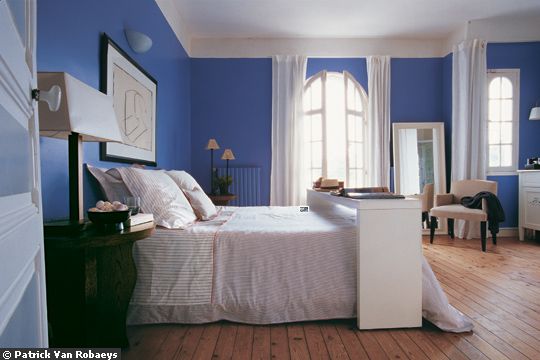
I really like this article on Elle Decor's site about color trends.  They have some good ideas on colors, which is what I need right now since I'm trying to decide on a color for my kitchen/family room.  I'm leaning towards a slate blue, but I'm just narrowing which one to use.  Have any of you used a light slate blue that you liked?

 
 Personal Style

“The best way to make our lives less stressful is to surround ourselves with colors we love,” says color consultant Bonnie Krims.
Some of the color pro’s all-time favorite colors include:
1) Sherwin-Williams: Determined Orange (6635) “It's is a safe orange. It’s bold without being garish or too bright. It’s a beautiful backdrop in a den or family room.”
2) Pratt & Lambert: Bayou (24-28) “This dreamy color makes you feel as though you are in the middle of the ocean.”
3) Benjamin Moore: Glass Slipper (1632) “Everything looks good with this faded neutral sky blue.”


Plum is the new Black

Color consultant Bonnie Krims swears plum is on its way to replacing black. Her plum suggestion: Benjamin Moore’s Purple Lotus (2072-30). “It’s a deep, rich plum and a nice neutral backdrop,” says Krims.

Credit: Benjamin Moore


Touch of Gray

A bedroom whose walls are painted in Benjamin Moore’s Sidewalk Gray (2133-60) evokes a calming influence. The room represents “Modern Tranquility,” a Benjamin Moore 2008 palette characterized by neutral hues that emphasize spaciousness with a quiet suggestion of color.

For more ideas on colors click here to go the article.

4.20.2010

Pinkalicious!

This pink springy outfit is for my A-girl, who is a lover of all things PINK! 
I'm just so happy that the yard is in full bloom now! Finally, after cold beginning to spring.
Don't you just love how refreshing spring is?

the links to these Pinkalicious items are found on my Polyvore site

3.16.2010

And it was all Yellow

One of my favorite kitchens!  
Serious! 
Crisp. White. Natural elements. 
Splash of color. Yellow.
 Just Awesome.


JCrew
 
Banana bread found on Design*Sponge
Fantastic Mr. Fox
 
Yellow: happy, fun, sunny, bright, bold, 
statement, warm, yummy, perfect.

OTHER COLOR POSTS: 

1.05.2010

Orange-you-glad it's a New Year?!?!

Orange makes me happy!
Orange is inspiration, it's joyful, social, cheerful and fun. Orange stimulates the appetite and aids digestion, keeps conversation flowing.....it's really just completely fab !!
Let's all smile to orange....


Related Posts with Thumbnails